The Great Depression parallels... busted
This is not just a deep recession or depression, or Great Depression II
by bart
June 20, 2009
The following monthly charts compare a few important data series during the periods starting September 1929 and October 2007, and simply measure the changes in growth or contraction. The actual facts in the monetary and fiscal areas are much different than most think or believe.
There are truly huge differences between then and now in the following statistics:
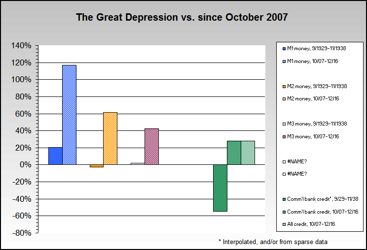
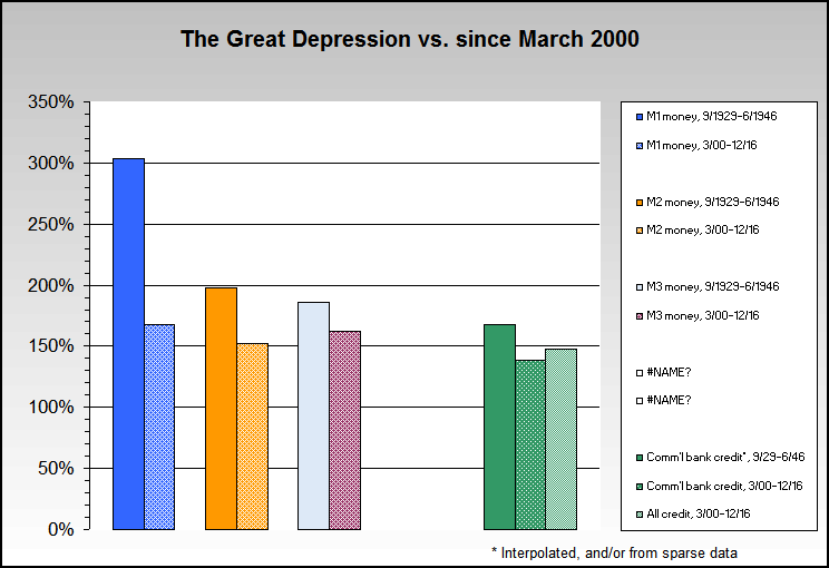
- M1 is up about 25% more now than during an equivalent period during the Great Depression, and shows positive growth.
- M2 is up about 22% more now than during an equivalent period during the Great Depression, and shows positive growth.
- M3 is up about 23% more now than during an equivalent period during the Great Depression, and shows positive growth.
- Bank credit is up about 22% more now than during an equivalent period during the Great Depression, and shows positive growth.
- Current GDP is up about 5% more now than during an equivalent period during the Great Depression, and still shows positive growth, although some believe that the current day GDP numbers are significantly lower than what is being reported.
As rough definitions, M1 is composed of cash and checking accounts, M2 adds in savings deposits and CDs under $100,000 and money markets funds (excluding IRA or Keogh money market fund balances), and M3 adds in CDs over $100,000 and institutional money market mutual funds and a few other items. Bank credit is "Bank Credit of All Commercial Banks" (TOTBKCR).
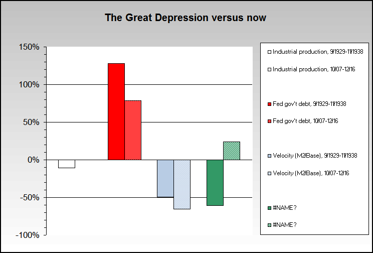
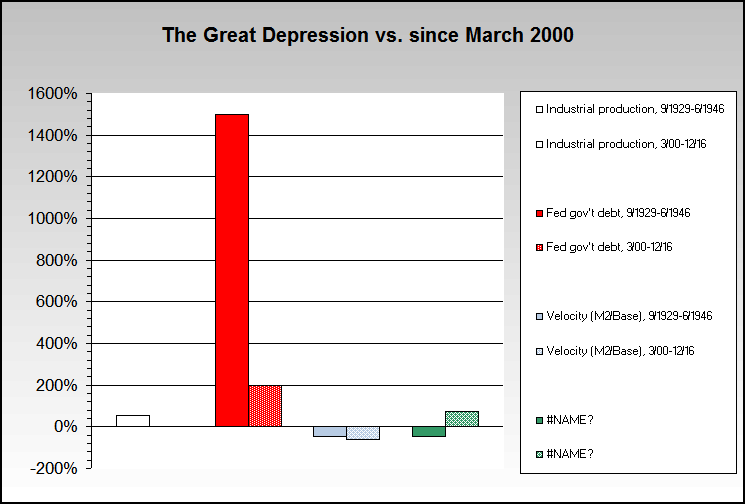
- The Industrial Production index is about 14% higher now than then, but has fallen about 14% since October 2007. It's not as bad as then. Additionally, industrial production in the U.S. fell over 58% in the recession in the mid 1970s from peak to trough.
- Federal government debt is up about 24% more now than during an equivalent period during the Great Depression, and shows significant positive growth.
- Velocity (the speed with which money moves through an economy) is down about 39% now when compared to the Great Depression, and in our opinion is the primary item holding back much higher inflation. Inflationary expectations are being managed by the Fed and government, etc. Also in our opinion, while debt deflation is quite real it's also a roughly equivalent situation to what was occurring in the 1930s.
- The Dow is about 24% higher now than then, but volatility makes the comparisons a bit dicey.
These are simply various rate comparisons at the beginning of the most recent month, with a comparison to the equivalent month in the 1930s. They are not differences since the beginning of either the Great Depression or the stock market peak in October 2007.
- CPI is about 7.5% higher now than during an equivalent period during the Great Depression. If John Williams of shadowstats.com CPI corrections are used, then CPI is about 13% higher now, and also shows positive growth.
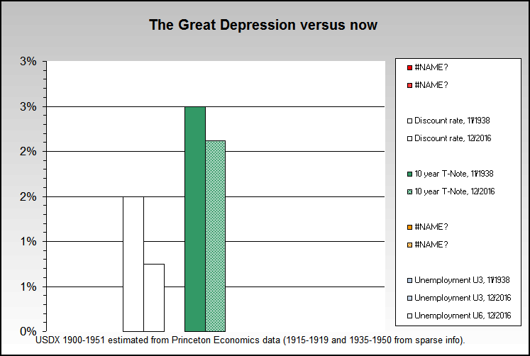
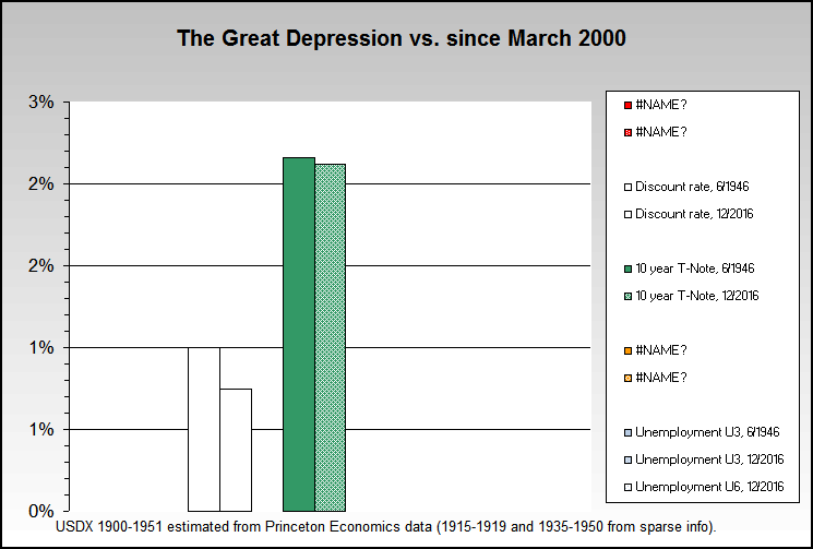
- The discount rate (the rate at which banks borrow from each other) is 2.5% lower now than during an equivalent period during the Great Depression.
- The 10 year Treasury Note is about the same when compared to an equivalent period during the Great Depression. It is a true parallel, if one does not adjust the rates for inflation differences, in which case it's about 7% lower now than during the Great Depression.
- Unemployment is about 7% lower now than during an equivalent period during the Great Depression, when using the "official" U3 unemployment rate. However, in our opinion the U6 unemployment rate from the Bureau of Labor Statistics is a much better rate to use for comparisons since its definition is much closer to the U3 rate definition from the 1930s. It is a true parallel when U3 is compared to U6, and the unemployment rates are virtually identical.
- The trade balance is in much better shape currently, being only about 2/3 down when compared to the start of both periods. The trends are also diverging between the two periods - now being much better than then... assuming protectionism does not get worse and that trade deficit financing does not turn into a major issue, and both are far from assured.
- Debt to GDP comparisons are much worse, and it is well above 75% currently. It peaked in mid 1933 at 40%, dropped and then peaked again higher at 43% in 1938.
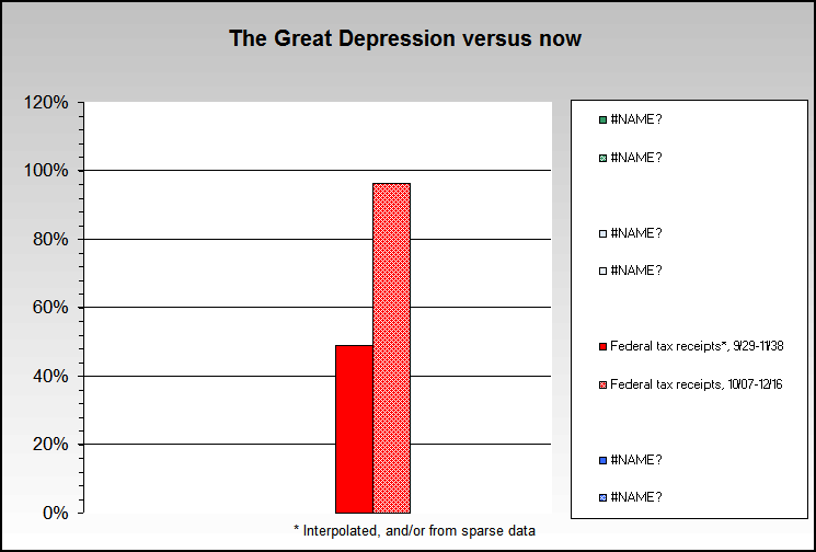
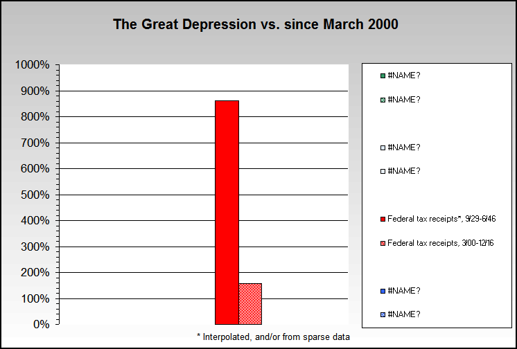
- Federal tax receipts are also worse now than then, being down about 34% since the 2007 peak. Do note that the 1930s data is sparse, and has been interpolated from yearly data.
- Housing prices have dropped about 2.5 times more now than then.
This is not just a deep recession or depression
The same charts as above, except starting in March 2000 instead of October 2007
It's not possible to show a truly full picture and comparison between now and the 1930s, and there certainly are items which are tracking the Great Depression quite well (like bank failures when total actual bank locations are counted), but its important to note the many items which are not tracking the Great Depression so that a fuller and more accurate perspective may be achieved.
Data sources: Federal Reserve, Federal Reserve archives, Bureau of Labor Statistics
Changes between then and now were calculated by taking the percentage growth from September 1929 mostly to April 1931 figures, which is the same amount of months between October 2007 and May 2009. Adjustments were made when data was not available for May 2009.
The charts above are maintained on our Great Depression page.
Now and The Future
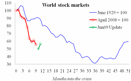
An alternate view on charts from Barry Eichengreen and Kevin O’Rourke
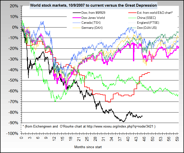
In their article A Tale of Two Depressions from April 2009 and updated on June 4th, some charts were included which could be quite misleading, and have been for many in our experience. As Barry Eichengreen and Kevin O’Rourke note, "World industrial production, trade, and stock markets are diving faster now than during 1929-30."... "The update shows that trade and stock markets have shown some improvement without reversing the overall conclusion -- today's crisis is at least as bad as the Great Depression."
We note that industrial production fell about 48% from peak to trough in the recession in the mid 1970s. It fell about 53% during the U.S. Great Depression. In other words, one could also say that the mid 1970s recession was very close to as bad as the Great Depression when judging by industrial production. The S&P 500 index fell about 48% during the mid 1970s recession, just for comparison.
And we have seen many sites link to the article without noting the starting date or current date issues, as well as not noting that there are many other statistics which show very different pictures and perspective as noted above.
Our basic concern is that they used a starting date for most of the charts of June 1929, which is the world industrial production peak, while the Great Depression itself didn't start for many months after the production peak. The charts also start of the current period at April 2008, which is 5 months after the U.S. official recession started in December 2007 and seven months after the stock market peak in October 2007.
Here are the Great Depression starting dates by quarter, sorted earliest to latest. As can be seen, the average starting date was significantly later than June 1929. The current date of April 2008 is also significantly later (a total gap of at least 8 months when compared to using actual Great Depression and current U.S. stock market peak dates), which quite significantly affects the picture shown in the various charts.
| Country |
Year, quarter |
| Germany |
1928,1 |
| Brazil |
1928,3 |
| Poland |
1929,1 |
| Canada |
1929,2 |
| Argentina |
1929,2 |
| United States |
1929,3 |
| Italy |
1929,3 |
| Belgium |
1929,3 |
| Switzerland |
1929,4 |
| Czechoslovakia |
1929,4 |
| Netherlands |
1929,4 |
| India |
1929,4 |
| Great Britain |
1930,1 |
| Japan |
1930,1 |
| South Africa |
1930,1 |
| France |
1930,2 |
| Sweden |
1930,2 |
| Denmark |
1930,4 |
Source
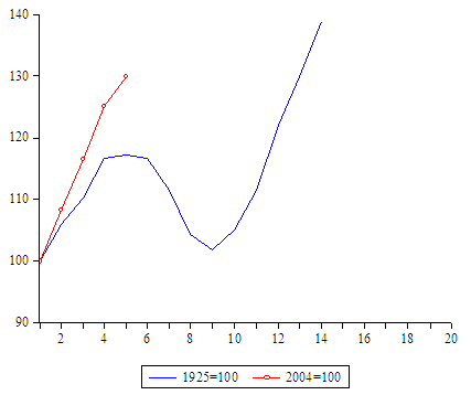
World stock markets, using U.S. Great Depression and current day stock market peak start dates
Barry Eichengreen and Kevin O’Rourke chart
World money supply, using U.S. Great Depression and current day stock market peak start dates
A similar situation with start and end dates is also apparent when looking at world money supply, then and now. Our chart below also shows detail from 2009, which again significantly affects the picture and perspective.
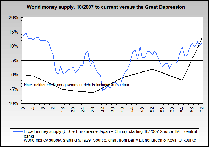
Barry Eichengreen and Kevin O’Rourke chart "Money Supplies, 19 Countries, Now vs Then"